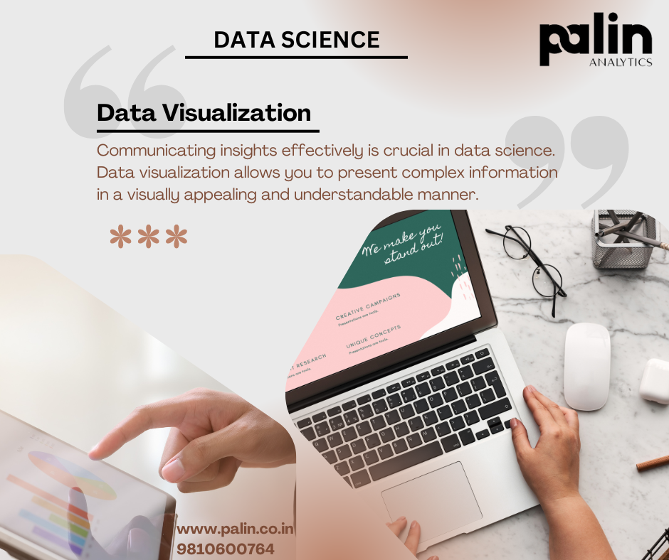
In data science, data visualization refers to the process of creating visual representations of data to gain insights, discover patterns, and communicate findings effectively. It is an essential component of data analysis and plays a significant role in understanding and presenting data-driven insights.
Data visualization in data science serves several purposes:
- Exploration and Understanding: Data visualization allows data scientists to explore datasets visually, identify trends, correlations, and outliers, and gain a deeper understanding of the underlying patterns and relationships in the data. Visualizations can reveal insights that may not be apparent in raw data alone.
- Communication and Presentation: Visualizations help data scientists communicate complex information and findings in a clear and concise manner. They provide a visual narrative that makes it easier for stakeholders, clients, or other team members to grasp the key messages and understand the implications of the analysis.
- Feature Selection and Engineering: Data visualization aids in feature selection and engineering, which involves identifying the most relevant variables or features for modeling and analysis. Visualizations help identify relationships between features, assess their importance, and determine which variables to include in predictive models.
- Model Evaluation and Validation: Data visualizations play a vital role in evaluating and validating predictive models. Visualizing model outputs, such as predicted values versus actual values, helps assess the accuracy and performance of the models. Visualizations can also help identify areas where models may be overfitting or underfitting the data.
- Storytelling and Data-driven Decision Making: Data visualization enables data scientists to tell compelling stories using data. By creating visually appealing and interactive visualizations, data scientists can present insights and recommendations that drive data-driven decision making within organizations.
To create effective data visualizations in data science, data scientists often use various tools and libraries, such as Python libraries like Matplotlib, Seaborn, and Plotly, as well as R packages like ggplot2 and D3.js. These tools provide a wide range of chart types, customization options, and interactivity features to create visually appealing and informative visualizations.
Overall, data visualization in data science is a powerful tool that helps data scientists explore, analyze, and communicate data effectively, enabling them to make informed decisions and extract valuable insights from complex datasets.